The QmartHub is an online food and grocery delivery service that launched in February 2023. Shortly after launch, the team in charge of this product became saddled with lots of complaints from users. Although the bounce rate was just a notch above average, the churn rate was soaring. This meant lower sales and a decline in orders. I was hired as a UI/UX specialist to identify problems target users were facing, make recommendations, and if necessary, overhaul the existing design.
My Role
Research, Usability Testing, Design & Prototyping
Challenge
Due to this product already being in the launch phase, time was our major constraint. We were under pressure to find a solution in the shortest possible time. A second challenge was the absence of any analytics data. The team had omitted setting up google analytics for the product.
The start
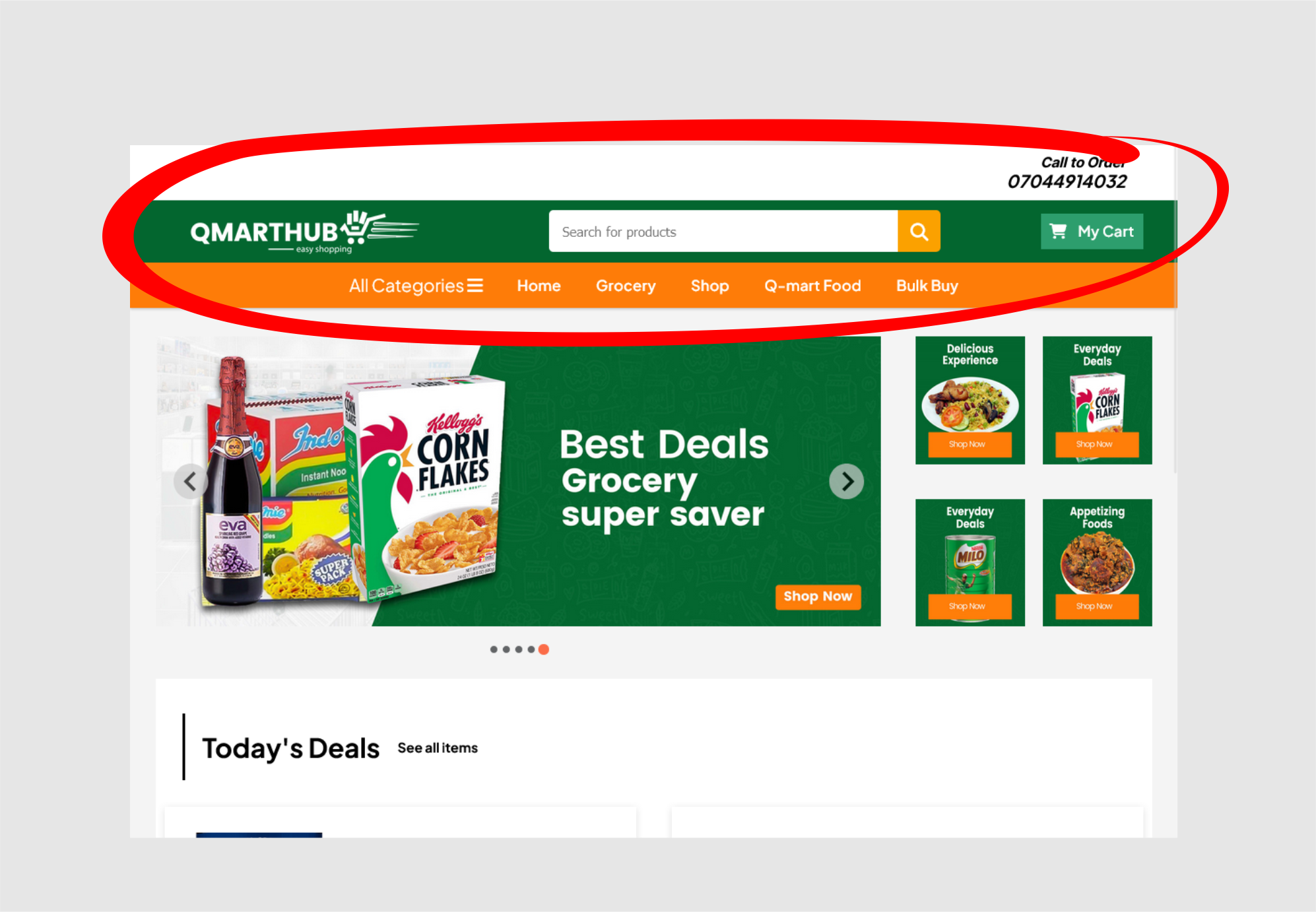
No product designer or UX expert contributed to the creation of the QmartHub website. As a result, early users of the platform where saddled with a myriad of quirks. As a result, the business only recorded one successful in-platform sale after weeks of launch. As a designer, my first inclination was to experience the website myself. This helped me better understand the product and the problems the users were experiencing.
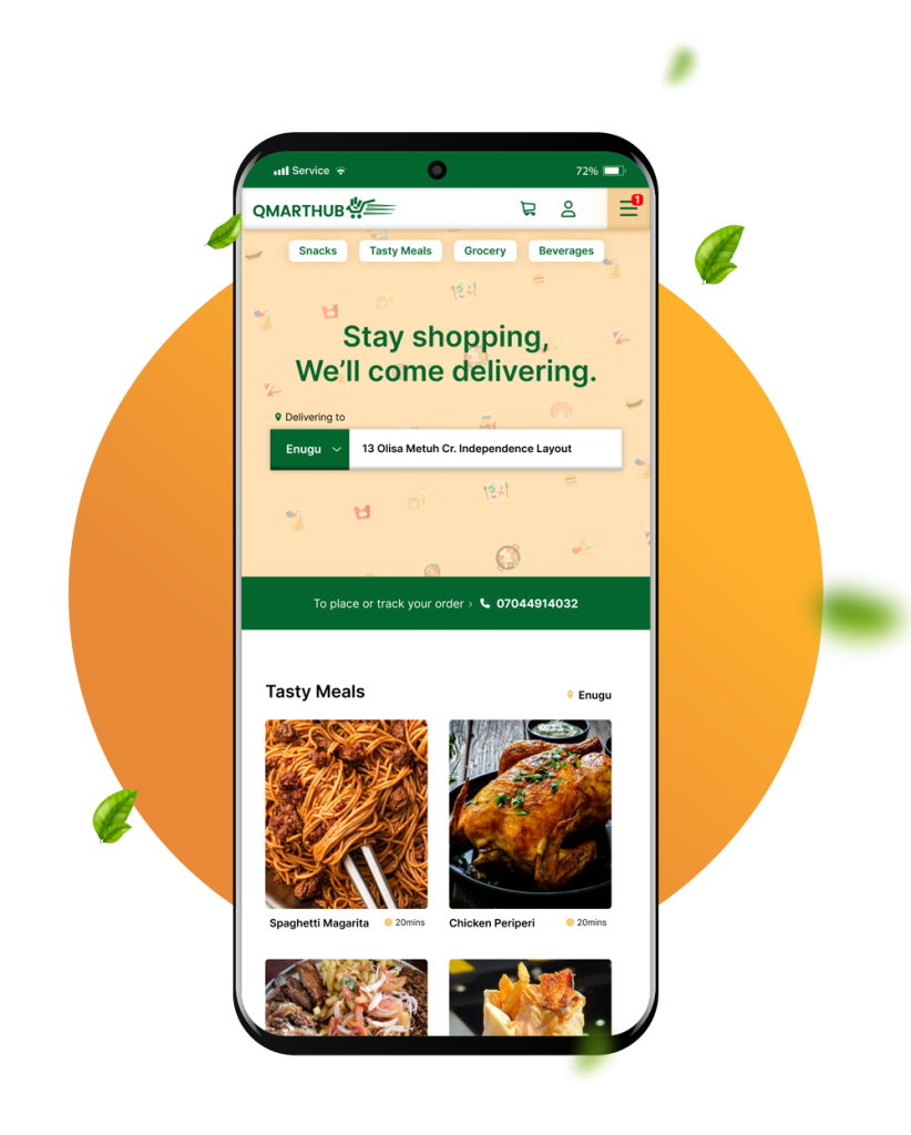
Image: The first user interface of Qmarthub.com
Testing for Usability
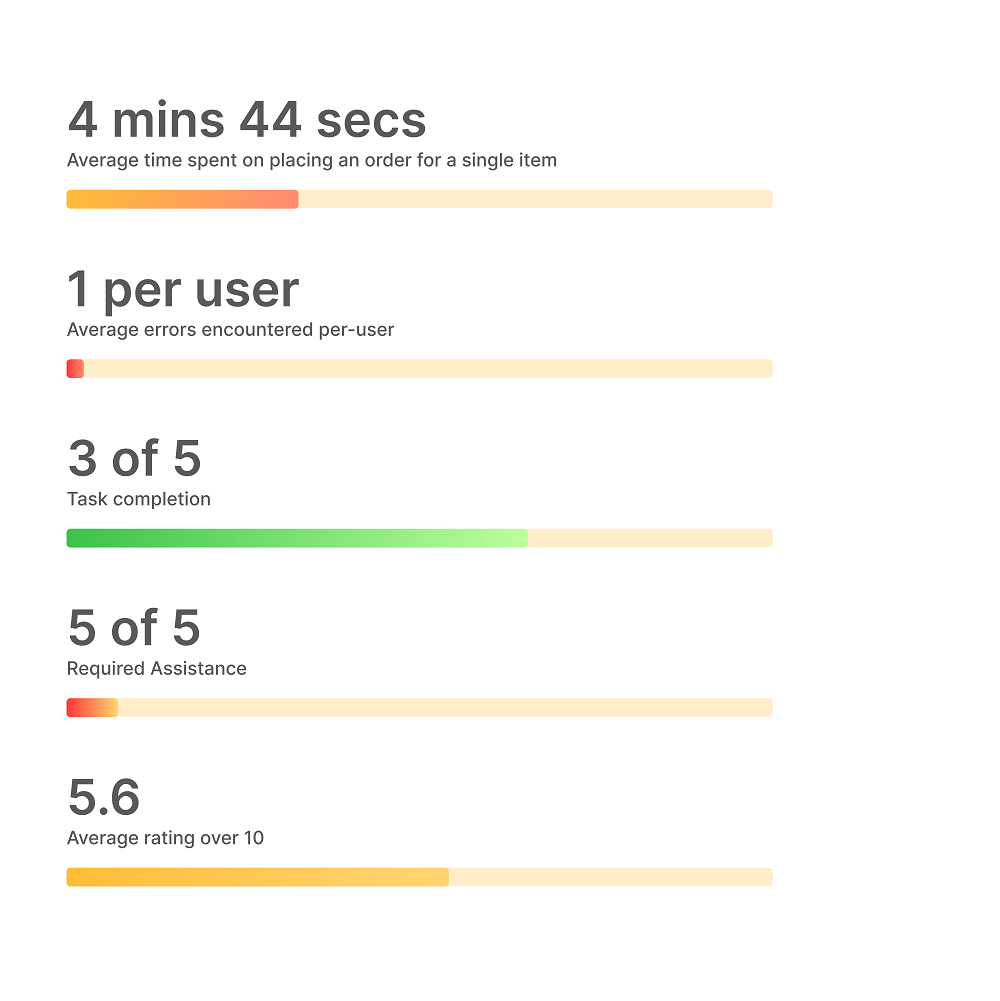
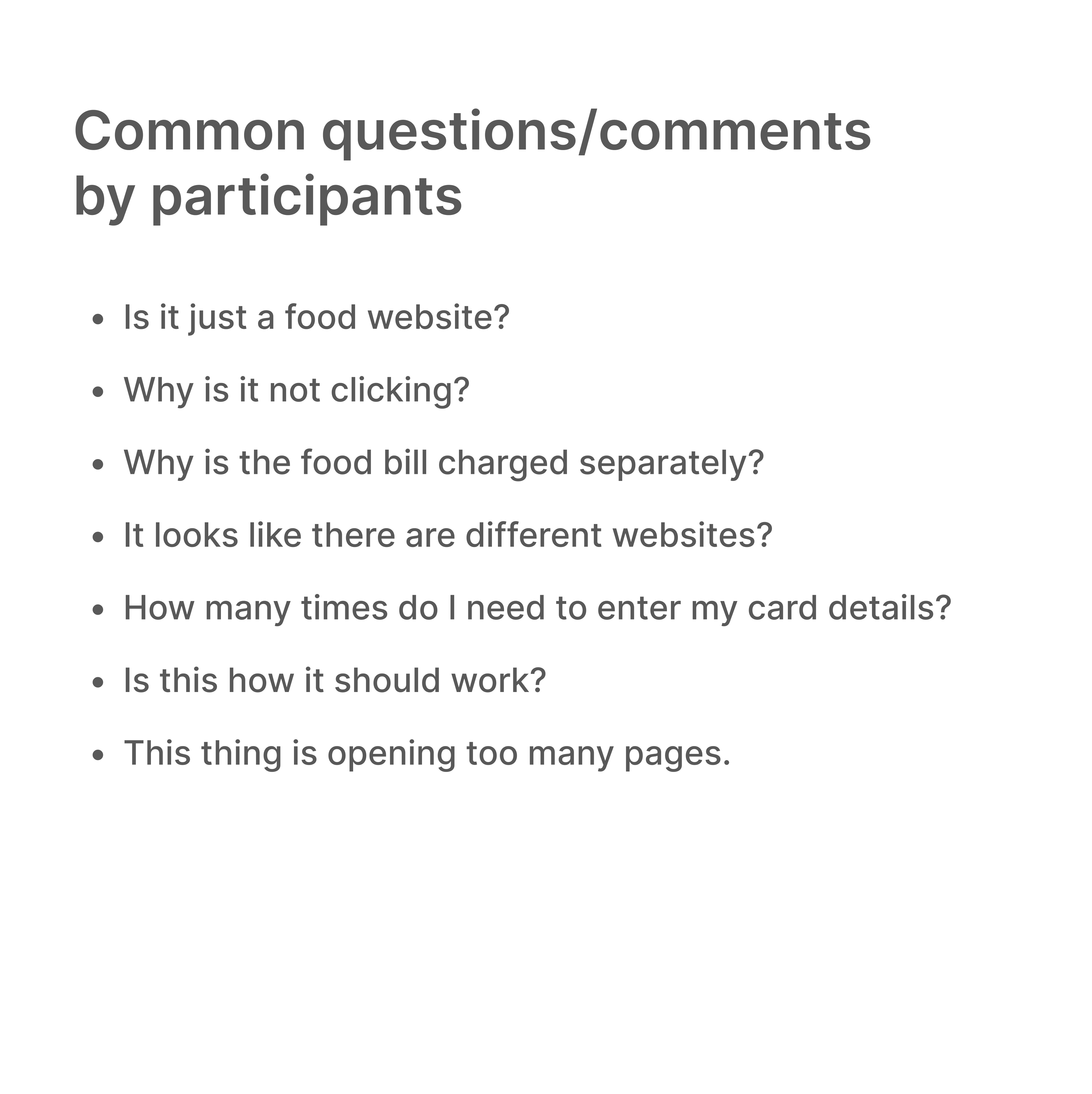
My usability test had a sample size of five participants whose demographics were identical to the business's target audience. I had selected people who were accustomed to using online shopping platforms. The primary task for this test was for participants to successfully place one order on the website while I timed their interactions in the background. It was considered a usability problem if participants could not complete the exercise within set time-frame. The objective for timing this test was to imitate real-life circumstances where users are in a rush or where distractions lead to cart abandonment. The participants, regardless, were allowed to proceed with the process of completing their order. At the end of each task, participants were asked the following questions:
Survey Questions
What was your experience using this application?
What were your annoyances?
What feature did you enjoy most about the app?
On a scale of 1 to 10 what would you rate the website.
Insights
One interesting thing about my findings was that at the start of my test, all participants were vocally excited about the app and demonstrated enthusiasm. However, midway in, there excitement became dampened. There was a willingness to use the application, a gesture that wasn't being reciprocated.
Defining the problems
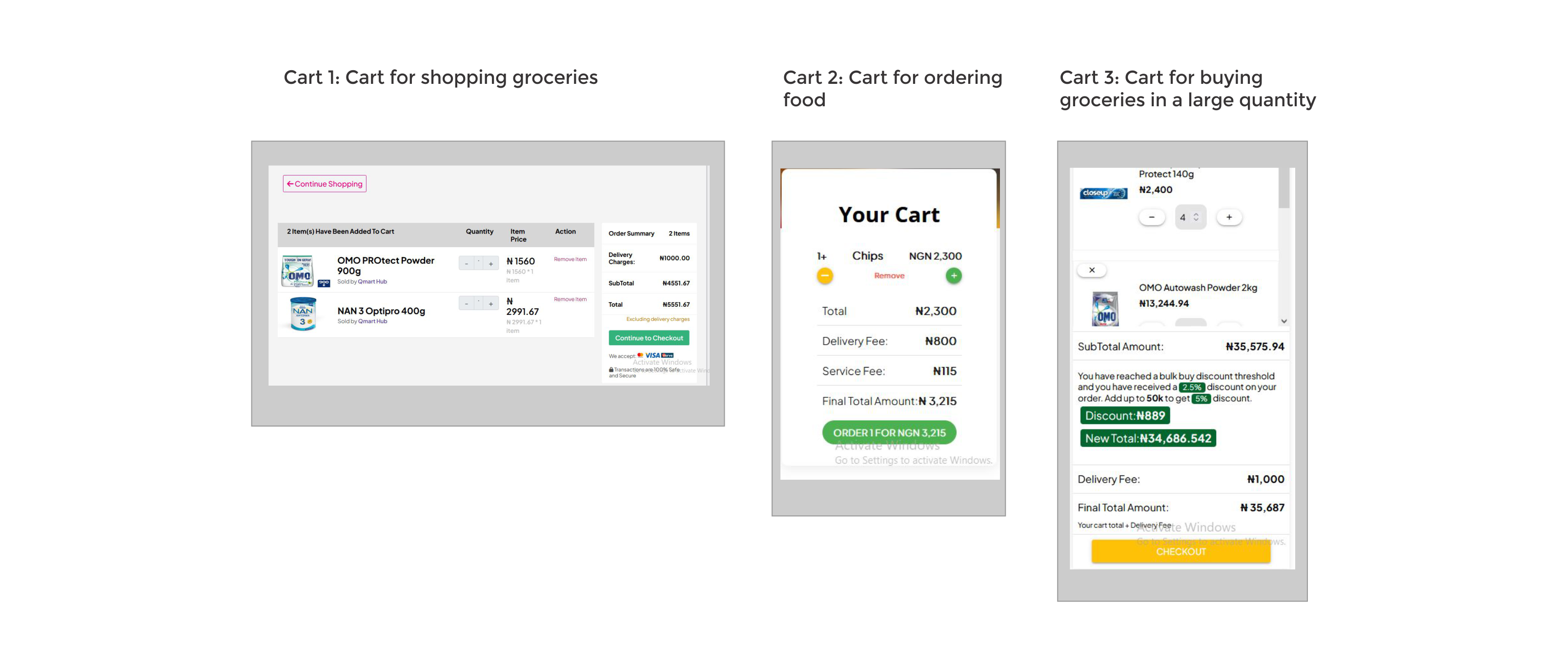
At this point, I had a comprehensive list of usability problems faced by users. it was clear as day what the issues were. One of such problems was caused by the dev teams’ decision to develop parts of the website in three separate domains. With this approach, each fraction of the website largely functioned independently of the others, with hyperlinks connecting the entire system together. The website had three cart checkouts and required participants to checkout more than once in some cases. There also was an omission of user registration which meant that users who successfully completed checkout were left in limbo.
1. Multiple checkout points
2. Untidy user interface design
3. Conspicuous site header
More Problems
Every process launched a new tab.
Certain actions triggers page reload
Lack of user feedback
Users have no option of logging in
Exceptions are displayed to users
Multiple dead clicks
Aligning with the developers
Before starting on the design, I met with the developers to better understand their previous decisions and how we could improve and optimize them to provide a better user experience. We discussed possible design implementations, how it would affect the existing database and how long it will take to implement them. My aim was not for the team to redesign the entire system, but rather to incorporate my suggestions into their existing design.
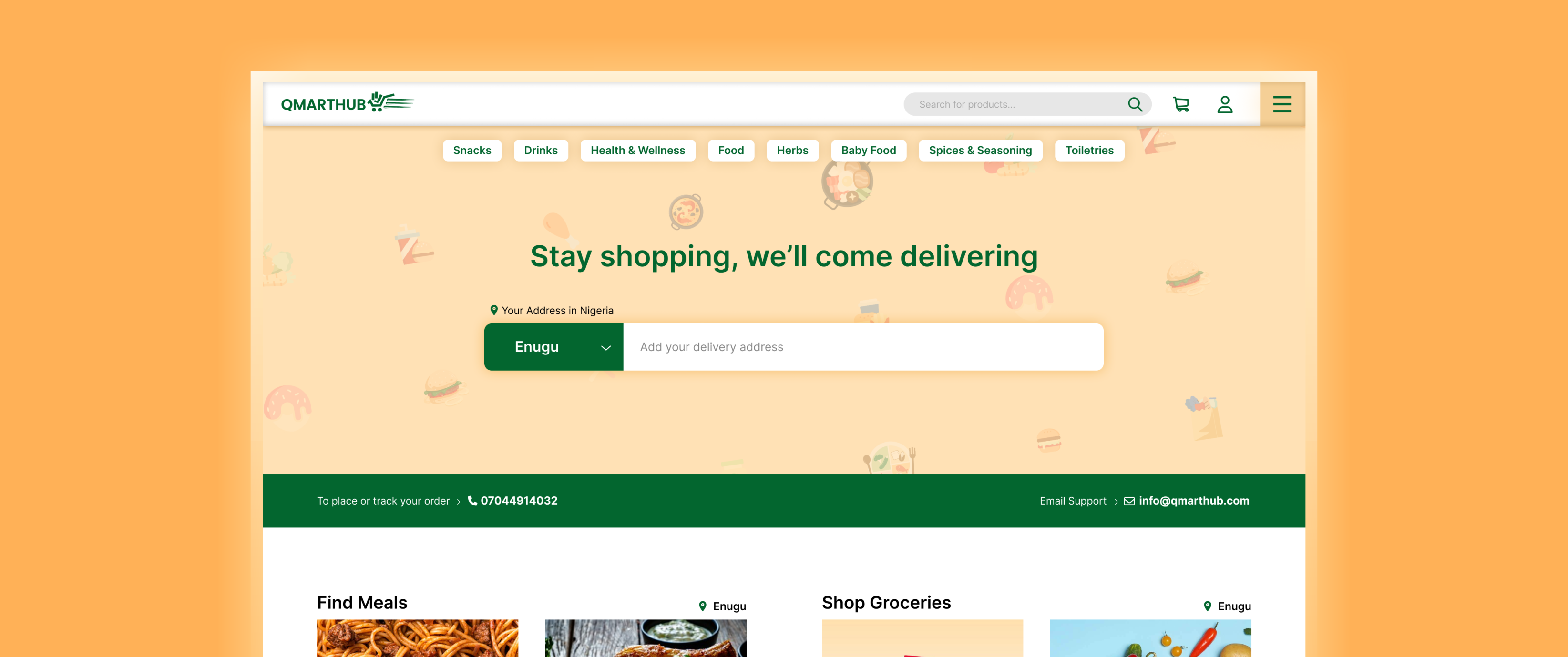
The New Design
I tried not to change too much about the existing user interface and flow. My goal was to limit the number of modifications that needed to be made and, as a result, reduce the project execution timeline.
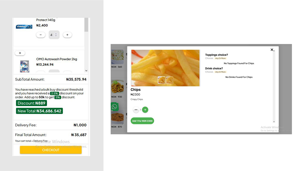
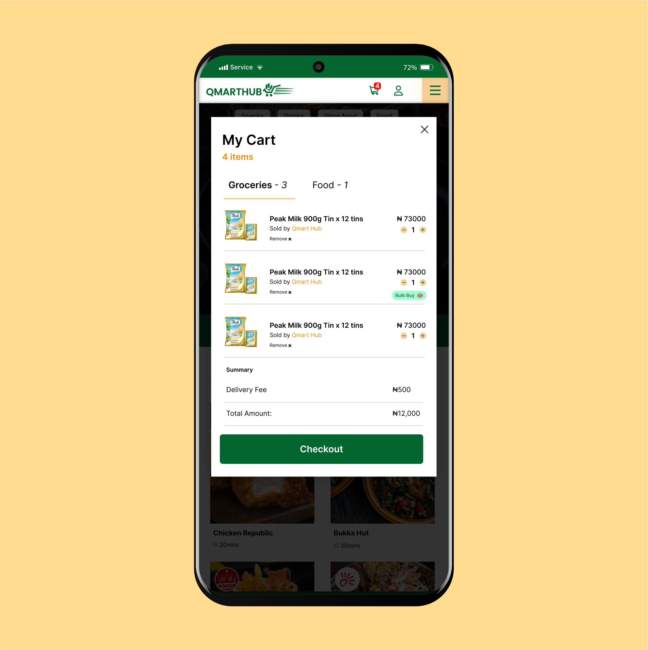
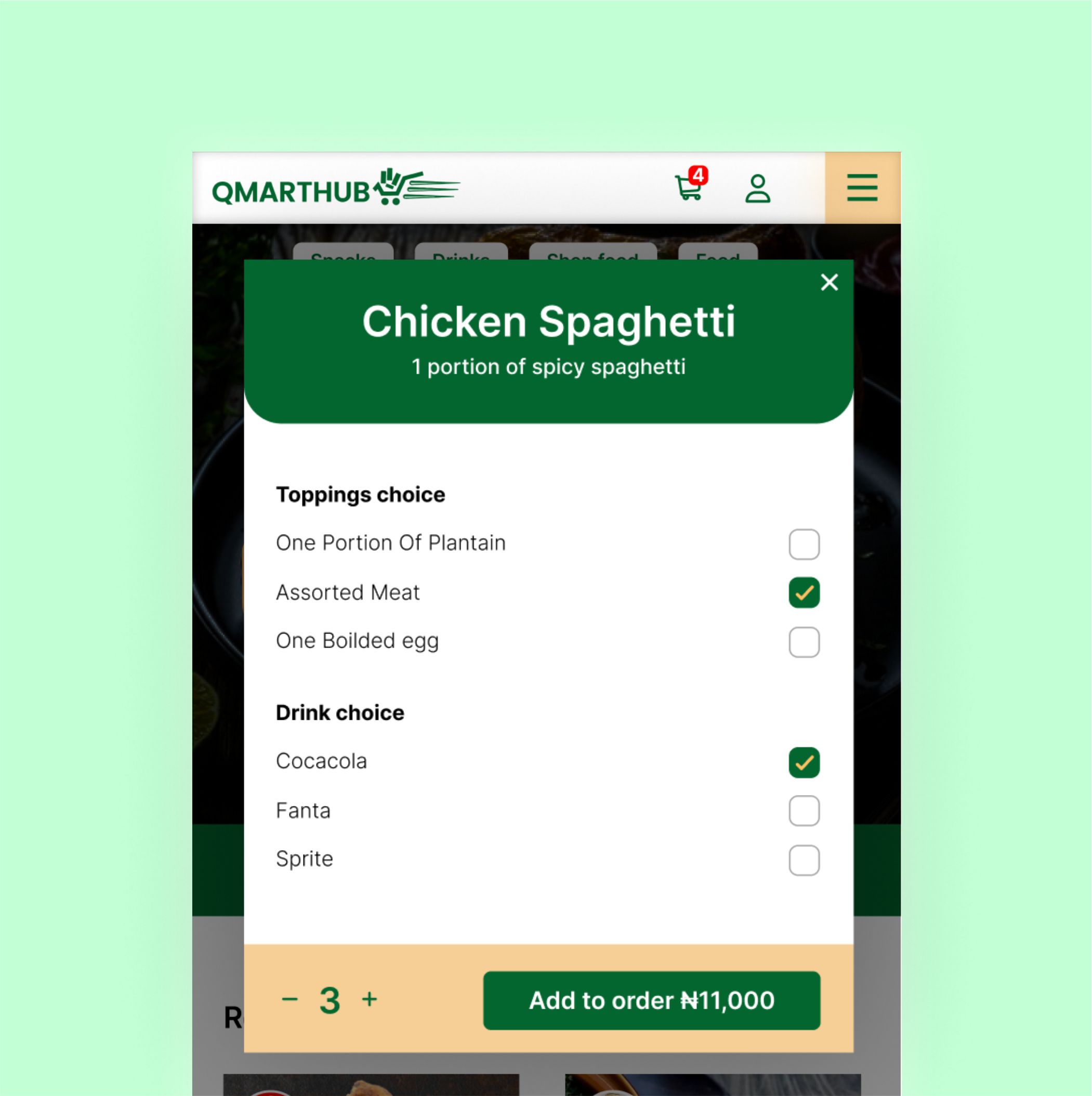
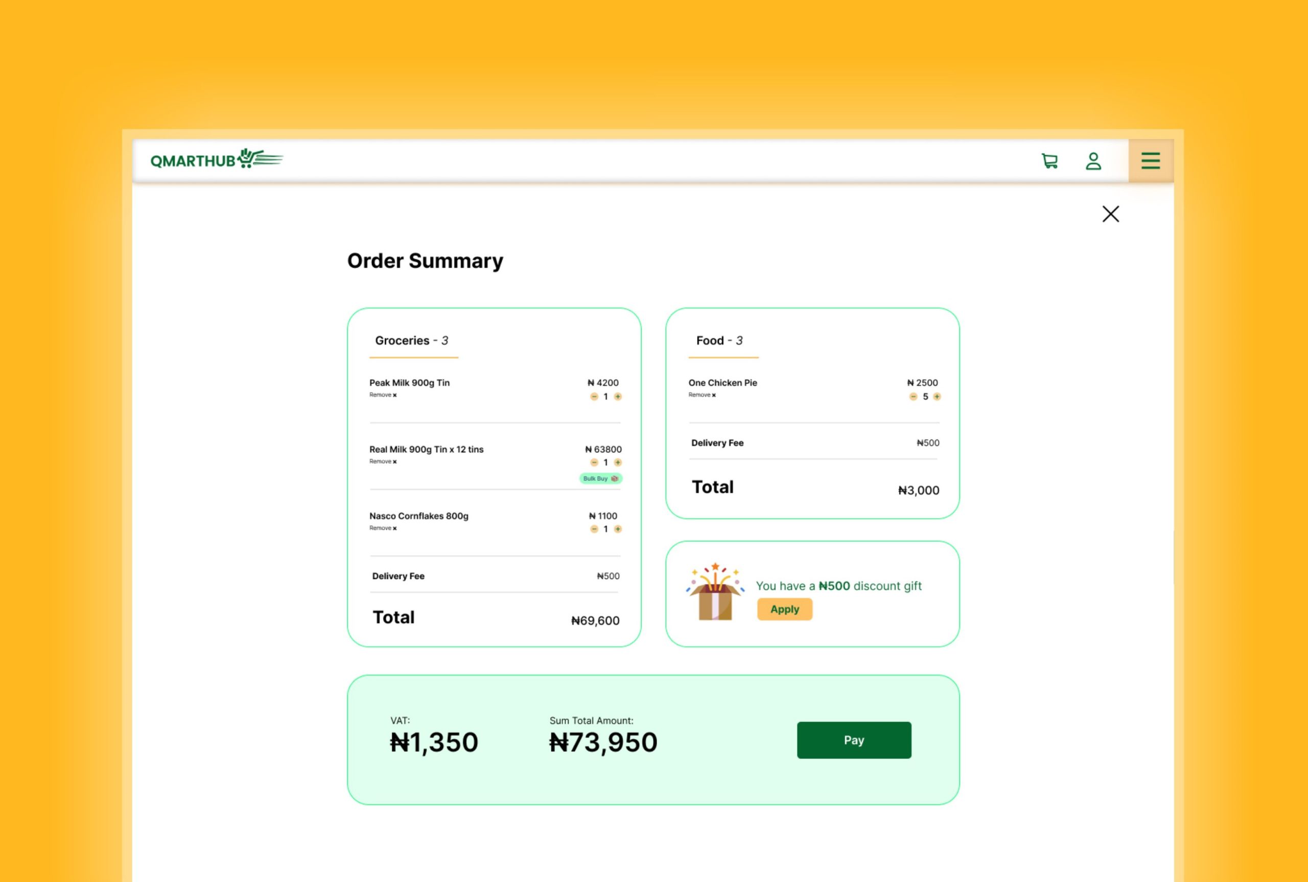
Improved cart experience
With this fresh design, I introduced the order grouping feature. This approach groups all items in cart either as food or grocery. Users who need to buy food and groceries at the same time would be able to do so in a single checkout. This eliminates the confusion caused by viewing the incorrect cart. Items purchased in bulk would also be easily identifiable here with a simple icon.
Improved checkout experience
Customers who purchase food may also require a drink. This new design simplified the ordering process. The redesigned layout also addressed the initial visual tackiness.
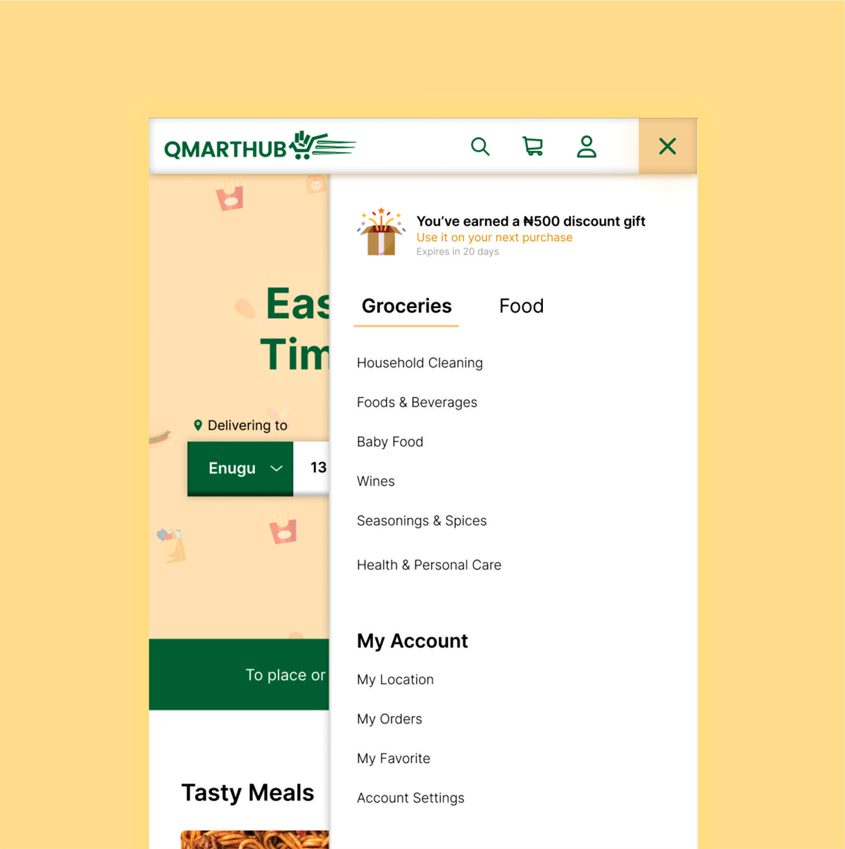
Three merged to one
To prevent page redirects when users switched between categories, I tied all interactions to one interface. The developers also had to change their approach to handling server requests.
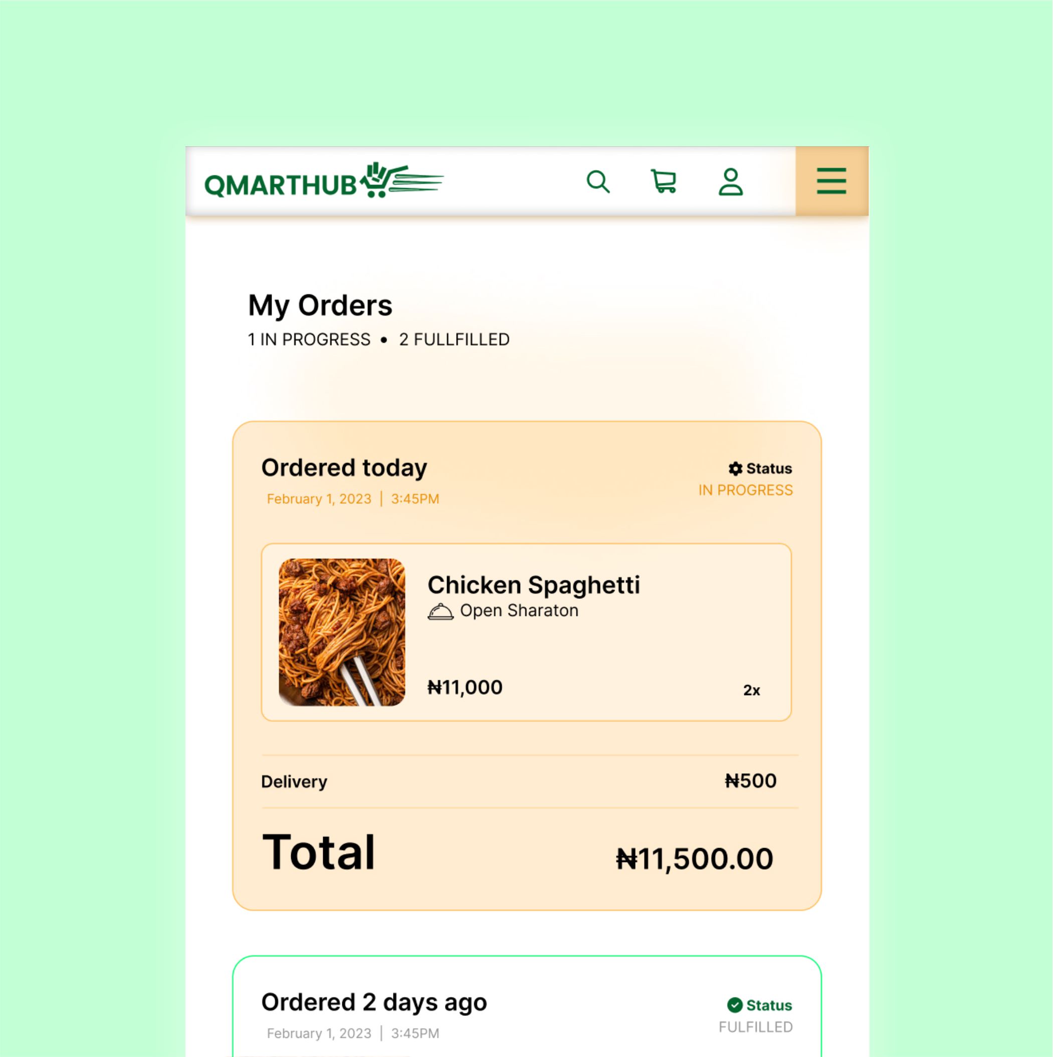
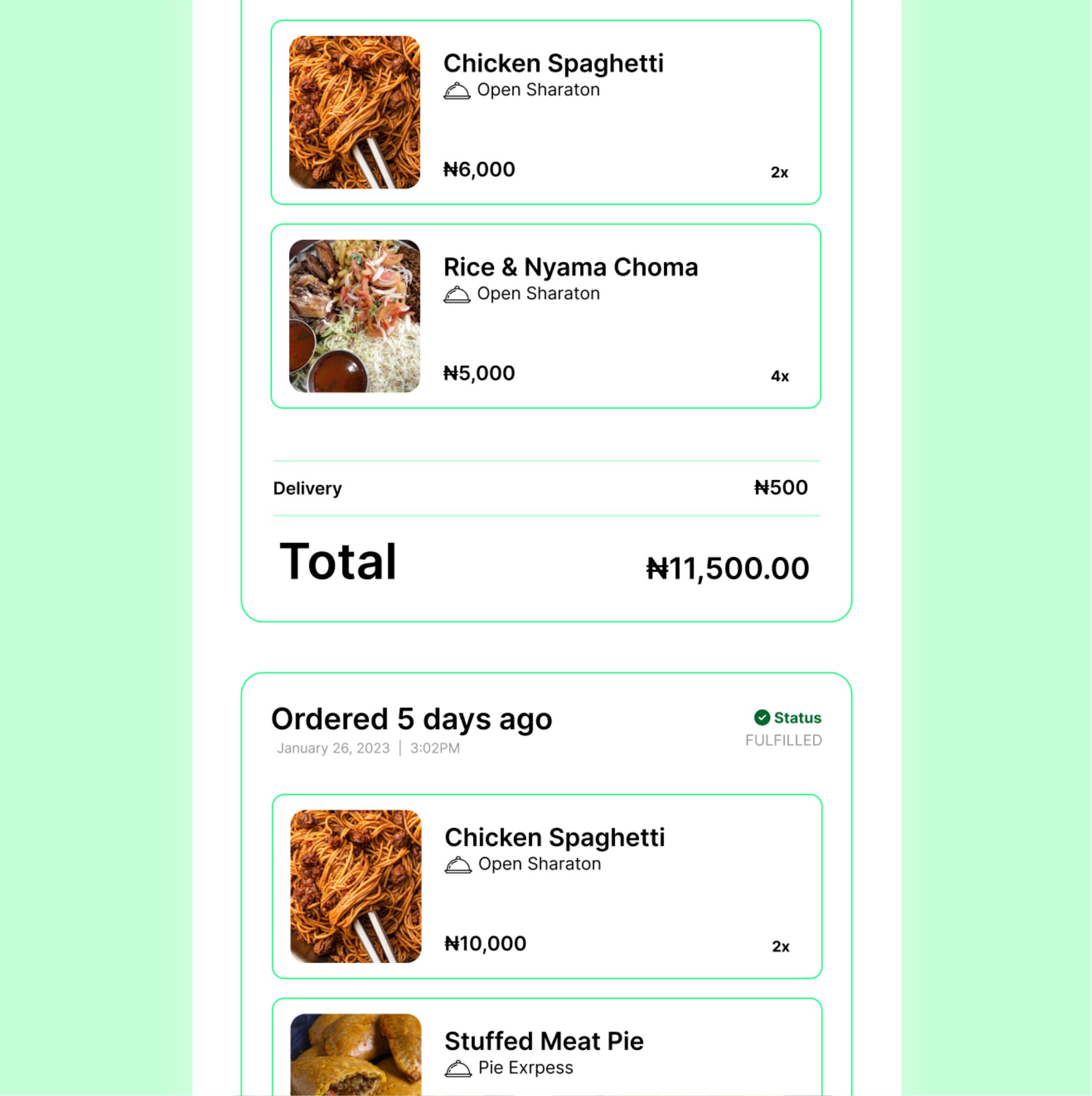
Traceability
New design offers users access to knowing what's happening behind the scene. Armed with a user dashboard, orders would now be traceable without users having to make phone calls.
Where we are
The developers at Qmarthub are actively implementing the design recommendations based on this research.